Sunday, 27 February 2011

Colour theory

There are certain guidelines that can be followed to make a website colours look good when combined together.
One thing that can make your website look good or bad is the amount of colours you use. too many colours will make the website look messy and cluttered and also hard for the audience to get around the site, which is often the case on websites, but too little colours will make it look plain and boring. The amount of colours that will work best on the website would be three.

Primary colour
This colour will be on a lot of the website, setting the tone for the website.

Secondary colour
This colour is to back up the primary colour, It could be a shade darker or lighter than the primary colour.

Highlight colour
This colour would contrast more to the primary and secondary colours. It is used to highlight important parts of the website but not too much.

basic color wheel
This is the colour wheel, which is helpful because it helps to understand which colours combine well.

Analogue Colours
The Analogue colour is the colours which are on either side of a given colour. A secondary colour, which is usually a shade darker or lighter than the primary colour, is most likely to be an analogue colour.

Complementary Colours
Complementary colours are directly opposite from one another, which are contrasting, making them stand out against each other in web design. These are good to use as highlight colours because the contrast makes it easy to see what you are highlighting.

Split Complementary colours
The split complementary colours are the colours next to the analogues compliment colour as the diagram shows above. These colour theory gives a high contrasting web page. However, this way is less extreme than using Complementary colours itself.
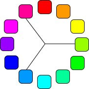
Triad colours
This colour theory is the colours equidistant from each other on the colour wheel.

Monday, 21 February 2011

Design elements

Eye Flow


Elements in the scene that guide the viewer's eye through the frame.

I simply used a piece of white paper shaped to look like it was fading away into the background, making your eyes wander from the bottom left of the photograph up to the top right.


Dominant Element

Usually one main subject in the image, It could be one object or a relationship.

This photograph denotes a phone, simply placed on a background of white. To show that the phone was the main object in this photograph, i raised the contrast of this photo using photoshop.

Simplicity

Uses the essential things to make up a photograph.

This photograph denotes a tick, I drew a tick onto some white paper, this is a very simple image and didn't need anything else in the photograph to know what the photograph is about.

Balance

It cant be symmetrical, asymmetrical, subtle or obvious.

I cut a piece of paper into two strips and symmetrically laid them out onto a black piece of paper.

The Rule of Thirds

  • Subject takes up 1/3 of the photograph

  • Subject takes up 2/3's of the photograph
These two photographs denote a person, simply standing in different position to show different compositions.

The Diagonal Rule

One side of the photograph is divided into two sections. The adjacent side is divided so that lines connecting to the resulting points form a diagonal frame.

I used two strips of paper and made them connect in the middle of the photograph.

Non Verbal Communication

  • Expression

This photograph denotes a person showing a wierd facial expression to make it clear why i have taken that photograph.

  • Eye contact
  • Still or moving
This photograph denotes the person making eye contact to the camera and is also very still, so I could take the photograph from the floor.
  • Clothing
  • Touch
  • Body movement
To convey touch, he denotes reaching out to the camera like he was touching it, he is also moving which looks like he is getting closer to the camera.

Positional Communication
Relationship between actors in a photograph

  • Reciprocal
I got them both to turn towards each other which denotes what reciprocal means easily.

  • Divergent
I made them look at the camera, away from each other.

  • Object
By using a remote control and getting them to both look at it, draws attention to the object.

  • Semi-reciprocal
By making one look at the other, and the other looking a different way, it denotes all the attention onto the person on the left.

Friday, 18 February 2011

Media Diary Post

As I said in the last diary post, I uploaded my logo's onto Facebook to receive people comments such as if they liked it and if they disliked it an why, and also their opinions on them.
The first logo received good comments as it was simple and professional looking however, it was a very typical logo which is why I would not use it.
The second logo had the best review, the only common statement made for this logo was that the writing PETA needed to be larger, which is why I will enlarge it when I come to put it onto the website as this is the logo I have chosen to use.
The third and fourth logo also had a lot of good comments however, people did not like the composition as the name of the charity was not bold enough or did not look good.

By doing the market research, it has helped me to decide which logo to use as the good comments helped me to choose. I also liked getting the good feedback for the work I have produced, making me feel like I am web designer.

Monday, 14 February 2011

Market research

To gain market research, I uploaded my designed logo's onto facebook to get the opinions from others. I asked them to comment on which one they liked best and maybe also reasons why they do or don't like it.

The good responses I got from this logo was that it was an effective looking logo, easily recognisable and there are only two colours used.
The bad response I got from this logo were that it was similar to other logo designs, which would not be good for the charity I am focusing on as they need to be recognised and original.


A lot of the market did like this logo, the good points were; the picture is original and entertaining, the wording of PETA is nicely placed, a lot preferred the writing down the side rather than over the dog or on the dogs jumper.
They also said that this logo could be improved by making the lettering of PETA larger, therefore making the logo more bold.


By having the different coloured PETA logo, they have said it makes it hard to distinguish the logo and writing from a distance, and also that the writing underneath the dog reminds one person of another charity. This logo had not got any good reviews about it, because of the positioning of the writing.


This logo is also said to look good. However, some thought the writing should be bolder against the blue jumper, as it is also hard to distinguish. It is also said that the dog could of been positioned differently, or even manipulated black and white, just showing the dog in black, its eyes in white, also its joints in white and the name PETA in white.

Overall, after reading the comments I had got on facebook about the four different logo's I have designed, I feel as though the second logo had got the best review from other people. This is because they liked the positioning of the lettering PETA, they liked the quirky design of the dog, and my website is aimed at people who are learning and are in education, so a logo with a novelty dog would be good and remembered.

To improve this logo I can take into account what the comments had said about making the logo larger, therefore making it more eye catching and very appealing to the public.

Thursday, 10 February 2011

Media Diary Post

I have recently researched into what makes a good logo and why. by doing this I learnt that it is definitely better to use two colours on a logo, as otherwise more colours would make the logo look to busy and it is also an expensive thing to do if your in the industry.
The creator also has to make the logo quite simple, as a detailed logo would be very hard to duplicate onto different products such as magazines and clothing, it will also take a lot of precious time to create.
Even though it is not the best idea to create a logo with a picture, I really want to as it will make the logo very diverse in comparison to other logo's I have seen and analysed. I chose to do this as my website is aimed more at the younger generation, and so when they see they logo with the picture on it, they will instantly recognize it. I will not include a strap line on the logo I am going to create otherwise it will clash with the picture and make it look too busy. I will also use two colours as I have learnt that this colour scheme makes a logo look clean and professional.

Once I had looked at what makes a good logo, I then drew rough sketches of what I want my logo to look like, experimenting with compositions and even a totally different logo. Once I had done this i then drew detailed drawings and outlined them with a black pen. I scanned in the designs onto Photoshop and then started to add colour and the charity's name. This was really fun to do as I liked manipulating the logo's using different colours; filters and different fonts for the charity's name.

Now that I have finished them, I am going to upload them onto Facebook and ask people to give their opinions on each logo, covering areas such as: if they like it or don't like it; where the font should go and what improvements I should make.

Sunday, 6 February 2011

Rough designs for my logo


This is the first logo design i made.


The second logo.

The third logo.


The fourth logo.


I designed four logo's for my website, three are quite similar and the fourth is different. I did three quite similar to see if they look different or better than the one before. The last logo was made to see if a more simple logo would work better on my website.

Tuesday, 1 February 2011

What makes a good logo?

To make a good logo, it would have to look good on the web page, newspaper and even on merchandise, for example, the Dogs Trust logo, PDSA's logo and RSPCA's logo all use two colours, meaning it wouldn't be too expensive to reproduce onto business cards, clothing and letters.
These three logo's look better than IFAW's logo because this logo uses three colours which looks too busy. Another downfall to the amount of colours IFAW uses is that using more than two colours can also be expensive, especially if you are printing the logo on letters, magazines and clothing.

The picture IFAW has of the hands in the shape of a globe would be hard to duplicate because it would be difficult to draw the hands in the exact shape and place, having more detail in the hands would also cost more to reproduce.

The logo also needs to be easy to make, if it was too hard to construct it would be too time consuming, too complicated to look at and it could also get plain looking after a while, it would also be hard to recognise if you saw it on a sign post.
The dogs trust logo shows a picture of a dog, which is simply made, it can also be duplicated easily and would look good on the side of lorries and power points.

Also, a good logo should have a picture, the name of the logo and it can also have a strap line, which usually comes after the name of the organisation. None of the logo's I have looked at have all three of these things except for IFAW's logo, however I feel that this logo looks too busy and would look better without the strap line or picture. PDSA's logo works well without a picture, as the word PDSA is easily recognisable.

However, for my logo I would like to include a picture and also the name of the organisation PETA without a strap line, because of my target audience being primary and secondary school, the picture would appeal to them more and they would recognise the logo easier.

For a logo to be seen easily, a rectangular shape would be easier to read than a square or any other shape. It's also easier to put onto web design and documents.
Another good way to make a logo is to stick to the same logo, as it makes it hard to recognise the corporation when the logo is constantly being changed and confuses people.